
Monday, 14 December 2009
Monday, 7 December 2009
The Sloop
A few days ago I was asked whether I could put together an open mic night poster for a local pub called The Sloop. I did my best for them and managed to put together a nice poster in a very short amount of time. I found this a very enjoyable project because my friend I was working for had very little idea about what she wanted the posters to look like. She sent me a message with all the information that needs to be included and I had free range to design what I thought looked good. This kind of project seems to suit me down to the ground, little directional imput from the client and as much creative reign as want.

Thursday, 3 December 2009

Tuesday, 1 December 2009

Sunday, 29 November 2009
Beautiful Websites.
They say that nothing is original any more, and design is all about ripping off other peoples ideas and changing them just enough that people can't quite remember what the work looked like before. So the first port of call with any project is to trawl around and find who has been doing it best. Here are some examples of some beautiful websites. Feel free to take a look around, you might see something you recognise.

http://www.agoodconcept.com/


http://www.agoodconcept.com/


Thursday, 26 November 2009
Screen Based Communication 2
New brief.
I always look forward to ending a project, and never quite remember the new and probably harder and more daunting project that will inevitably follow the one I have just handed in. The promise of new challenges, the chance of making this the best project yet, a clean slate, a blank page…the chance to ruin everything.
The brief I received today is called Screen Based Communication 2. It entails me designing, coding and creating a live website. Very daunting, considering I haven’t the foggiest how the internet works. But I’m sure I’ll pull through, I got a very good mark for last years Screen Based, strangely.
Monday, 23 November 2009
Visual Communication in Context 2
Now that Visual Communication in Context 2 is over, I can look back at the unit as a whole. This topic had notable similarities to the Text and Image unit from the beginning of last year, except this year was obviously a lot harder and stressful. Brilliant.
I have always had trouble with time management but I think I’ve been keeping it under control this year quite effectively. On ND, I’m not sure that there was one project I managed to get handed in completed and on time. Honesty, I have no idea what I’m doing here. Why wasn’t I kicked off the course? I can remember at least one project that I didn’t even begin. What a joke!
But the important thing is that I’ve moved on now and grown up. I can proudly say that I have managed to get all my projects in on time, completed and not one referral. Check me out.
Visual Communication in Context 2 challenges my biggest weak points of time management and multi tasking, and even though I found it difficult and stressful and tiring I finished everything as asked, even if it was a little rough along the way. Now come the best part, waiting to see if I’ve fail yet.

Friday, 20 November 2009
Communicating Ideas.
The first and foremost decision I faced in the Communicating Ideas brief was which lecture I was going to base the next two weeks of my work on. I watched all seven videos on TED.com, making detailed notes, waiting for something to catch my eye. I was initially trying to steer clear of the talks about creativity, as I saw these as the obvious choice to make, but as I watched through for a second time it became obvious that I felt a strong affinity with what Elizabeth Gilbert was saying and could deeply relate to the pressures and trials of creative minds, the drive to surpass themselves and the deep seated fear of failure. I started my personal creative journey by looking around at how other people have portrayed creativity and imagination visually, and found that there’s not really a great deal of substance in this field, and knew that I was going to have to go on alone. I took a different approach by trying to think of how I come up with ideas, where do I find inspiration? Elizabeth Gilbert suggests that all ideas come from the world around us, from outside of ones body and uses the vivid imagery of ‘Geniuses’, a small, invisible, mystical creature that follows us around and acts as a muse. However attractive this idea was to me, I felt I needed to avoid the obvious path of images of pixies and fairies and take a more conceptual route. I thought about where I get ideas, and these are inevitably the least appropriate of places. The toilet, of course! I had a strong image in my mind, and a fitting strap line, “Inspiration always chooses to strike at the least opportune moments.” Or should that be most inopportune moments? I had an image of a man on the toilet, deep in thought with my strap line, and this was placed onto a novelty door hanger. I couldn’t help but think that novelty gifts lack substance, and needed to place my work in a context. I decided to use Elizabeth Gilbert’s talk as a way to sell a product, ‘Post-It’ notes, the king of note pads. I developed the idea that instead of a man sitting on the toilet, writing on toilet paper, I would show the after effects of idea generation, a room full of Post It notes in the most obscure thinking room of the house, the bathroom. I see the sea of Post It notes covering the walls as a striking and unusual sight, with nothing but the white toilet left untouched. I chose not to use an image of a person sitting on the toilet because I thought this could be seen as too vulgar and perhaps offensive, but have still kept humorous connotations of the scene. The empty toilet lets the viewer fill in the gaps as they see fit. I have used Helvetica Bold in my poster because this is the font that is used in the Post It note logo, which I have also included. I’ve kept the writing small and understated as to not detract attention away from the image. My poster is design to be placed portrait in a magazine.


Monday, 16 November 2009

Friday, 13 November 2009
Inspiration always strokes at the least opportune moments.

Least opportune, or most inopportune?
That is the question.
Monday, 9 November 2009

Sunday, 8 November 2009
It's a black fly in your chardonnay.
Ironic, isn’t it? Me, sitting here trying desperately to think of a way to visually express the idea that genius comes from outside of a person. That ideas are some kind of divine inspiration. What am I trying to say? That being a creative infers that I have some kind of direct line to God? A god? Anything? Coz I’m pretty sure there’s not even a direct link between my hand and my brain at the moment.
I feel there’s something in the idea that you always get ideas on the toilet, or in the shower or in bed at night when the lights off and there’s no pens handy and you step on an upturned plug and curse into the darkness.
I could always go expected way and draw some fairies, that’s what everyone else is going to do, right?
Monday, 2 November 2009

Power Pies Part II
Brilliant, thank god that’s over. I didn’t think I’d be using maths on this course, but I guess Visual Communication is a more eclectic course than I had every imagined. I completed the design for my power pie tin, and when it came to applying the design to the tin, I realised that no matter how accurate my measurements were, there’s just no way I can fit it on the original tin. For the most frustrating three hours of my life I toiled over a scalpel and managed to put together a brand new tin, well, I guess you’d call this a cardboard. Anyway, long story short, old to new, completed.
. I looked closely at the packaging of protein and vitamin supplements and have used a visual language that would be appealing and familiar to the people who buy these products.
My target audience would be mainly men so I have used a lot of manly fonts and colours. Power Pies is branded across the front of the packaging in bold Impact, a big san serif font. There is a drop shadow behind the text to bring it out and make it jump off the page. I have used the italic text to convey the feeling of movement across the page, this also applies to the rounded arrow at the bottom that follows the curve of the tin. Black and red are manly colours, and help the design to be big and bold. Red and black are also the main colours used in protein supplement packaging.


Thursday, 29 October 2009
Power Pies
Ohhhhh, what a tiring day this has been. I’ve spent many a frustrating hour working on my Power Pies design, and I’ve come so far. I have the lid, and a rough idea of what the hell I’m going to do with the rest of it, and I know for sure that tomorrow is going to be another long day. I had a tutorial today where I was given a great deal of helpful suggestions as to what way to take my design, and I think I’ve come up with something that might work. Actually, I’m feeling fairly confident about it. I just hope that I don’t get such a bad reception in tomorrow’s crit as I did last week. I’m not sure I could take that.
Wednesday, 28 October 2009
Mid week slump.
What else is there to say? I’ve been working on this same project, day in and day out, crawling closer to the inevitable disappointing outcome. I’ve worked today with nothing but a simple pen and paper, and have drawn up something that looks like it could conceivably be an acceptable steak pie lid, and all I can hope and pray is that it looks good enough when I finally manage to run myself in circles around illustrator and turn it into something that looks like it should. Well, as long as I’ve got Google and Sammie, I think everything should be fine. Everything is going to be fine.
Sometime, I just feel like I’m going to hyperventilate, but then I think about finishing the degree, and I get even more anxious. I wonder why I’m even bothering with a degree in such a competitive subject, where even I don’t like my work. I guess I just keep hoping that one day I’m going to stumble across the subject that I will excel at and find my niche. We can all hope, ey?
On a lighter note, the Arts University have deemed my background as suitably impoverished, that I am entitled to £250 to go on holiday. I’m just wondering where all this money is from? I guess it’s a good thing that my £10,000 loan is going towards something important. But hey, who says that going to Amsterdam for a week, a city famed for it’s studious attitude of course, isn’t important?
Who am I to judge?
This blog have been completely and utterly useless. Not much of a Carrie Bradshaw. Thankyou for reading.
Monday, 26 October 2009
Are all graphic designers liars?
Turns out that it’s impossible. It is impossible to re brand tinned pies. They’re just horrible, horrible creations. I think, if the product is really that repulsive, maybe it should just be left to die in peace. I’ve tried different demographics, different packaging, shapes, sizes, but every time it come back to the elemental fact that we are dealing with a pie in a tin. A pie, in a tin. The only conceivable demographic that would ever even think about eating something as disgusting as a tinned pie are disgusting in themselves. Am I sincerely proposing that I can conceivably market tinned pies to the masses
I am re designing Fray Bentos tinned pies, which are an awful, awful product, and I’m trying to re brand them as some kind if super energy food, something an active person would want to eat when they get home from the gym, after playing a game of football. But I can’t get away from the fact that these are still pies in a tin. So, I guess the real thing to do is lie. Lie to the customers, trick unsuspecting browsers to part with their hard earned cash and buy a truly dreadful product, that I am putting my name on and vouching for. Maybe this is what graphic designers do. Are all graphic designers liars?

I am re designing Fray Bentos tinned pies, which are an awful, awful product, and I’m trying to re brand them as some kind if super energy food, something an active person would want to eat when they get home from the gym, after playing a game of football. But I can’t get away from the fact that these are still pies in a tin. So, I guess the real thing to do is lie. Lie to the customers, trick unsuspecting browsers to part with their hard earned cash and buy a truly dreadful product, that I am putting my name on and vouching for. Maybe this is what graphic designers do. Are all graphic designers liars?

Tuesday, 20 October 2009
It's fondue.
Yesterday was an entirely unbloggable day, the first truly awful day I’ve had yet this year on this course. The day started at seven thirty, and that’s never a good time to start anything. Following a decidedly subdued PAL session, we received, probably, a well deserved dressing down from our tutor. Sadly for me, I can’t help but think that I have been trying my utmost hardest over the last few weeks to cram as much work in as possible, and if that still isn’t good enough, then I guess I’m just not cut out for the course. And there’s nothing wrong with that, we can’t all be successes in life.
Now onto a marginally more positive aspect of my academic life, I use the term academic in the loosest possible manner. Our third and penultimate brief in Visual Communication in Context Two is called ‘Old from New’, and entails us picking an unfashionable food stuff from the list on our brief, including: tapioca, lard, mushy peas, rice pudding, fondue, tinned pies, Spam, luncheon meat and tinned vegetables. I have chosen to re brand tinned pies, mostly because despite them supposedly being redundant, I think that most of these products are actually quite good sellers. People like peas, Muller have released their Muller rice in yoghourt pots, fondue, although dreadful for you, is quite fashionable. I have chosen to do tinned pies because it’s just such a horrible concept for food. I mean tinned pies? Pies, in an actual tin?
Now onto a marginally more positive aspect of my academic life, I use the term academic in the loosest possible manner. Our third and penultimate brief in Visual Communication in Context Two is called ‘Old from New’, and entails us picking an unfashionable food stuff from the list on our brief, including: tapioca, lard, mushy peas, rice pudding, fondue, tinned pies, Spam, luncheon meat and tinned vegetables. I have chosen to re brand tinned pies, mostly because despite them supposedly being redundant, I think that most of these products are actually quite good sellers. People like peas, Muller have released their Muller rice in yoghourt pots, fondue, although dreadful for you, is quite fashionable. I have chosen to do tinned pies because it’s just such a horrible concept for food. I mean tinned pies? Pies, in an actual tin?
Monday, 19 October 2009

Harry Malt Draws Pictures
Harry Malt Draws Pictures, apparently, and he does it very well. Searching the web today, looking through recruitment agencies, I came across a lovely little gem of an artist on debutart.com by the name of Harry Malt.


You can find more examples of Harry Malt's work at:
http://www.debutart.com/artist/harry-malt/work/2576
I couldn't help but get excited about his endearing and wonderfully entertaining doodles. Here is a selection of my favourite:


You can find more examples of Harry Malt's work at:
http://www.debutart.com/artist/harry-malt/work/2576
Sunday, 18 October 2009
Illustrators are just kidding.
Doesn’t seem that any creative input I’ve had in Marie Antoinette’s business identity seems to make any difference to anyone. I did what I thought was a lovely little illustration of a pile of cupcakes, obviously symbolising Antoinette’s fabricated ignorance towards the working class of her country. But the reasons I couldn’t go ahead with my initial idea are two fold. One, if I were being employed by Antoinette to create a business identity for her, would she really want to be publicising the negative propaganda that had been spending through France all of her adult life? Would she also appreciate the reference to decapitation by me cutting her name in half at the top of the card? I can’t really imagine so, to start with, she’s not going to even know that her life ended atop a messy guillotine.
The second reason that I can’t use my hand rendered illustration on my work is because it just looks rubbish! I stated this course with the idea that I could take any project and steer it in a illustrational direction, but now it seems that I just can’t do that, Maybe I’m broken, or I’ve forgotten how to use a pencil? Does that happen?
So, in the end, I caved, as usual, and took the more graphic route, took Louis XV royal crest, and paired that with a bit of script text. Bish bash bosh, royal correspondence. Simples.

Saturday, 17 October 2009
Psychosis
It’s been a tough week, and although I started this blog with all the best intentions, I have just not had time to post on it. Of course that‘s a lie, a post should take 20 minutes out of my day, but recently I have been spending my days pulling my hair out and skirting the borders of psychosis. The moments I don’t spend clicking aggressively on a hostile computer-ma-bob, I spend pacing up and down the corridor outside of the room that contains the hostile computer-ma-bobs, repeating briefs and useless conclusions under my breath, contemplating the horrifying possibility of becoming the newest looser in the Vis Com race.
I have my second PAL session as a responsible second year on Monday, and they’re going to expect me to show this pathetic excuse for an account of my life. I guess they’re going to be feeling smug when they realise the poor competition they have in this second year at least. Good on them, I guess.
I have my second PAL session as a responsible second year on Monday, and they’re going to expect me to show this pathetic excuse for an account of my life. I guess they’re going to be feeling smug when they realise the poor competition they have in this second year at least. Good on them, I guess.
Friday, 16 October 2009
Let them eat cake!
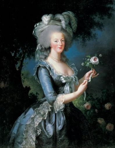 One of the most famous images of Marie Antionette, 'Marie Antionette a' la rose'. Painted in 1783, meant to counteract the muslin dress scandal, where Marie was painted in a plain dress, thought not to be fit for a queen.
Another day, another deadline. Today was a mad rush to the finish line, facing the critique concerning our corporate identity brief. I was lucky enough to get a very interesting historic figure, Marie Antionette. For me this was not only an opportunity to work on a piece of design work for my portfolio, but also to learn more about an inspiring woman.
Marie Antionette was born in Austria, the daughter of a king. Her family were slowly killed off by small pox and after a frosty relationship with her mother, a relationship which apparently gave the young princess feelings of awe inspiring terror. At he age of fourteen, Martie Antionette was shipped, well, more accurately dragged by a horse drawn cart to France, where she was given the sole duty to rekindle the frosty relationship that Austria and France had long suffered.
The Princess was married to an aloof son of King Louis the XV, who would soon be crowned Louis XVI at the death of his elderly father. The young couple was forced to rule the ecenomically troubled country, while their personal life was rife with tension and frustration as Louis XVI had a low sex drive, and Marie Antionette had to wait seven years before they marriage could be finally consummated.
The Queen finally gave birth after a long wait and a harrowing labour, all the while the country was wallowing in poverty. Marie Antionette passed her long days spending the country’s money and seeking sexual gratification with men and women alike. The country were quick to turn on her, blaming her for the country’s poverty. Marie Antionette’s friends and trusted advisors were all killed off by madame guilotine, and her lady in waiting was raped, beaten and her body ripped apart, her genitals mutilated and her breats cut off. The woman’s head was then put upon a stake and parraded under the Queens window, where she was ordered to kiss the lips of her favourite. Poor Marie Antionette fainted instantly, and was spared most of this brutal sharrad.
Louis XVI was nest to go, the Queen grief striken refused to sleep, eat or take any exercise. She was finally put out of her miserey exactly 216 years ago today on the 16th October, 1793, her last words being simply, “Pardon me Sir, I meant not to do it.”

Thursday, 15 October 2009
PAL training
With the gruelling PAL training behind us, we are now armed with the tools to control a rowdy group of youths. After partaking in embarrassing role play, designed to make us ready for when our first years inevitably fall back into their natural mob mentality, we were ready for what he world had to throw at us. We are the prison guards, the only barrier between civilisation and it’s certain downfall.
Of course, that was all nonsense. When second years are asked to act like first years, of course we all behave like 5 year olds, and when the first years behaved well, like the mature students they are, we were all left slightly bemused. Monday severed as first contact, lift off, touch down. Our rigorously planned out session went swimmingly, and we could then all retire to a breakfast of pastries and tea, all on the university, brilliant.
Yesterday brought up the next challenge on the first/second year bonding front. Our very first Vis Com social as the responsible second years. We mingled and chatted and all got progressively more drunk as the more adventurous, or perhaps less wise of the group bounced the hours away on the in garden trampoline. Sadly, one second year, who perhaps should stay unnamed, let the side down, in dissolving into a drunken stupor.
Wednesday, 14 October 2009
Part one, complete. I have designed a poster to thank the great Salvado D’Amate for his contribution to my life, and I guess other people as well, for inventing glasses. I have used the visual language that you would expect to find in places such as opticians, and think this poster would be displayed in such places.
The layout of my final piece for Thank You is very much dictated by the official constraints of the Snellen eye chart. The font that is traditionally used in eye charts is Courier Bold, and the top most letter measures 88mm in height. I then had to work out the sizing of the rest of the letters from this, and could do this using a few simple calculations.
The main problem I had with this unit was trying to fit a comprehensive sentence into the word count allowed. This forced to really compromise on what I could put onto the poster, and had to shorten a lot of the words down. I feel that despite this, I managed to adequately get across the message I was trying to say.
I have used Helvetica Bold down the side of the sight chart to dictate the distance to which you are supposed to be able to view the writing from, this is the font used in official sight charts, and has added to the overall visual language of the piece.

Monday, 12 October 2009
Pencilcide
Good afternoon internet people.

Well, the hardest part of the course is over, I have thought up a satisfying and suitably obscure blog name. Phew.
The first week back from my seven or eight months of stewing in my own filth over the summer holidays has been a serious shock to the system. Nights of debauchery, followed by subsequent days of dozing in and out of consciousness are over. Early nights and bright mornings fill my foreseeable future, laid out like a metaphorical path of hot coals, a symbolic minefield of deadlines, multiple deadlines, and some more deadlines.
I would first like to point out that my late starting of this blog is not due to idleness, for I have been working very hard, competitively completing my briefs to as high a standard I can muster, so that in the future, I will emerge as king of this castle, the master of the Visual Communication genre, bow before my greatness.
The first day back we were thrown in at the deep end, given our brief within hours of stepping in the door, on a dark, drizzly Monday morning, no doubt. Eight weeks, four projects, no sleep. We started with the ‘Thank You’ project, where we were asked to choose a person in history that has done something that deserves recognition. Sounds simple, you might think? Perhaps, might even sound fun? Oh, boy, how you are mistaken.
Through the development process, we all started with logical ideas of people to think, I thought maybe to thank teachers, then perhaps even cows. But as we progressed though the critique process, we became aware that our choices were all wrong. Apparently, cows don’t readily offer themselves up for slaughter; therefore don’t deserve the thanks that I was planning on bestowing upon then. News to me.
So I broadened my thankful horizons, thinking who has helped me in my life. Considering I live a sheltered life of Coronation Street and roast dinners, no one jumped immediately into my mind. Then it hit me, my only flaw! My poor vision has plagued me throughout my life, the fear of somehow loosing my glasses wake me up in the depth of night, a cold sweat furnishing my brow.
The first usable glasses were invented in 1284 by a wonderful Italian man (I know, I know; wonderful AND Italian?) named Salvino D’Armate. Thanks to ol’ Salvito, I can now live my life without constantly walking into walls, and slipping under busses, which is always annoying.

Subscribe to:
Comments (Atom)
